DailyUI Challenge

This project started as a way to step out of my comfort zone. As an introvert, sharing my work publicly wasn’t easy, but I wanted to grow. So I took on the #DailyUI challenge: 100 days of UI design focused on creativity, consistency, and self-improvement.
Throughout the journey, I worked on a wide range of interfaces, including login forms, dashboards, pricing pages, and apps. To make it easier to explore, I’ve divided my favorite designs into two categories: Mobile Design and Website Design.
Each project represents a small step forward in building stronger habits, gaining confidence, and connecting through design.
Design Process
Daily Prompt Analysis
1
2
Ideation & Wireframing
3
Visual Design & Iteration
Each day starts with reading the design prompt and identifying its core goals. I think about the intended user, context, and functionality, making sure I understand what makes that UI element successful in real products.
I sketch layout ideas in Figma, testing different compositions, structures, and flows. At this stage, I focus on usability and clarity, while also leaving space for creative expression.
Once the wireframe feels right, I move into high-fidelity design, choosing color, type, and visuals that enhance the concept. I review the result against design principles and tweak based on how it feels and reads visually.

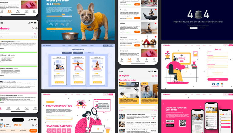
Mobile Design
A selection of mobile app designs focused on clear navigation, playful visuals, and user-friendly interfaces.
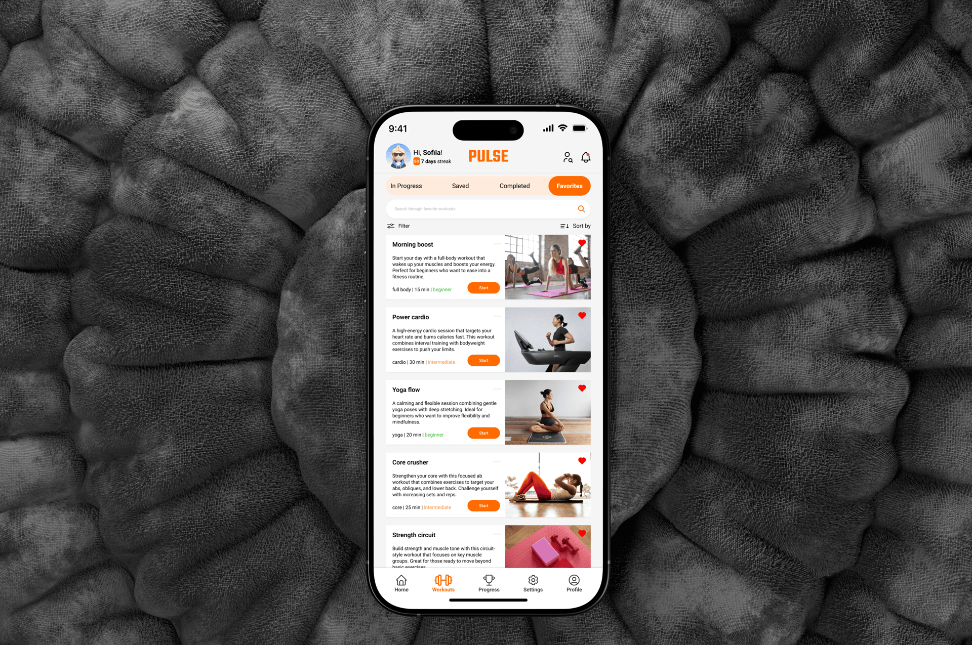
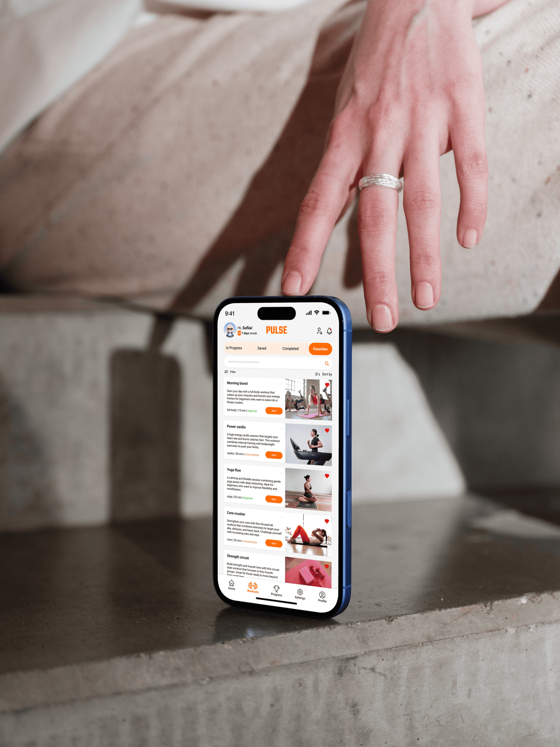
Pulse
A clean and intuitive "Favorites" screen for a workout app, designed to help users quickly access and manage saved workouts. The layout features motivational streak tracking, category tabs, search and filter tools, and action-ready workout cards, all built with consistency, clarity, and user motivation in mind.
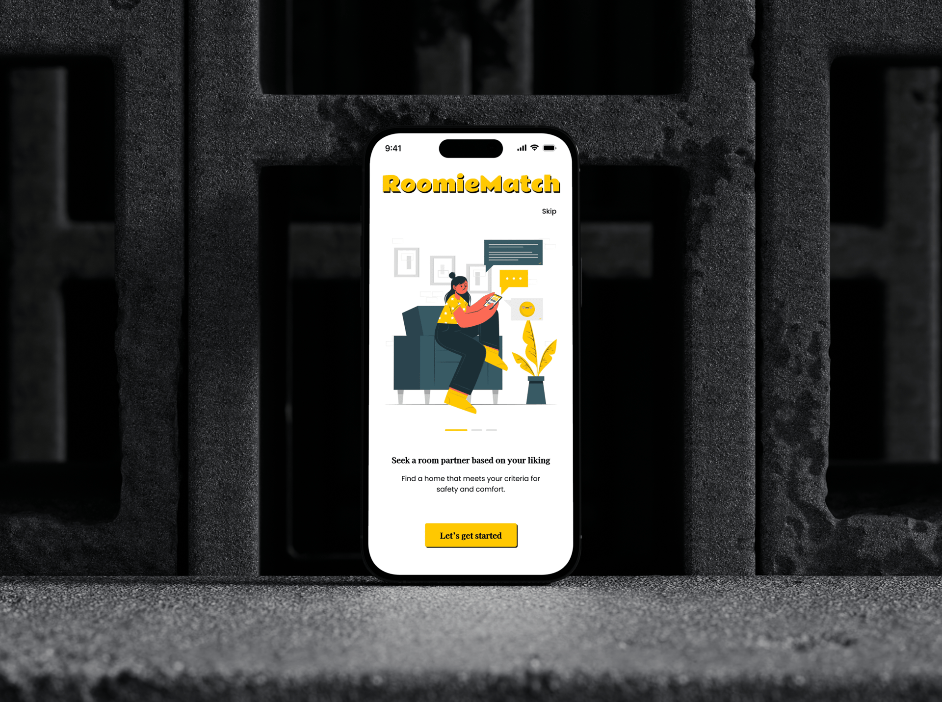
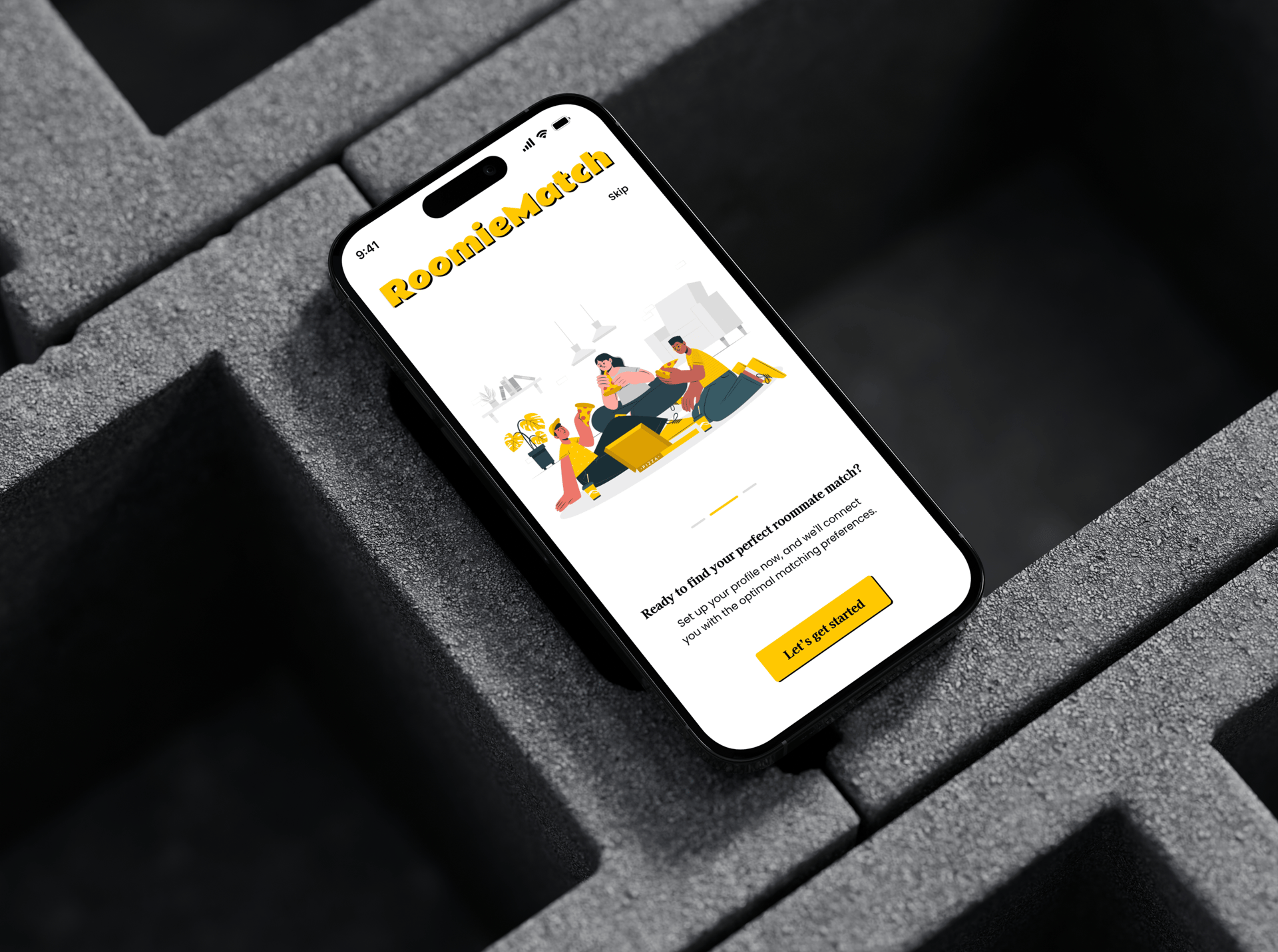
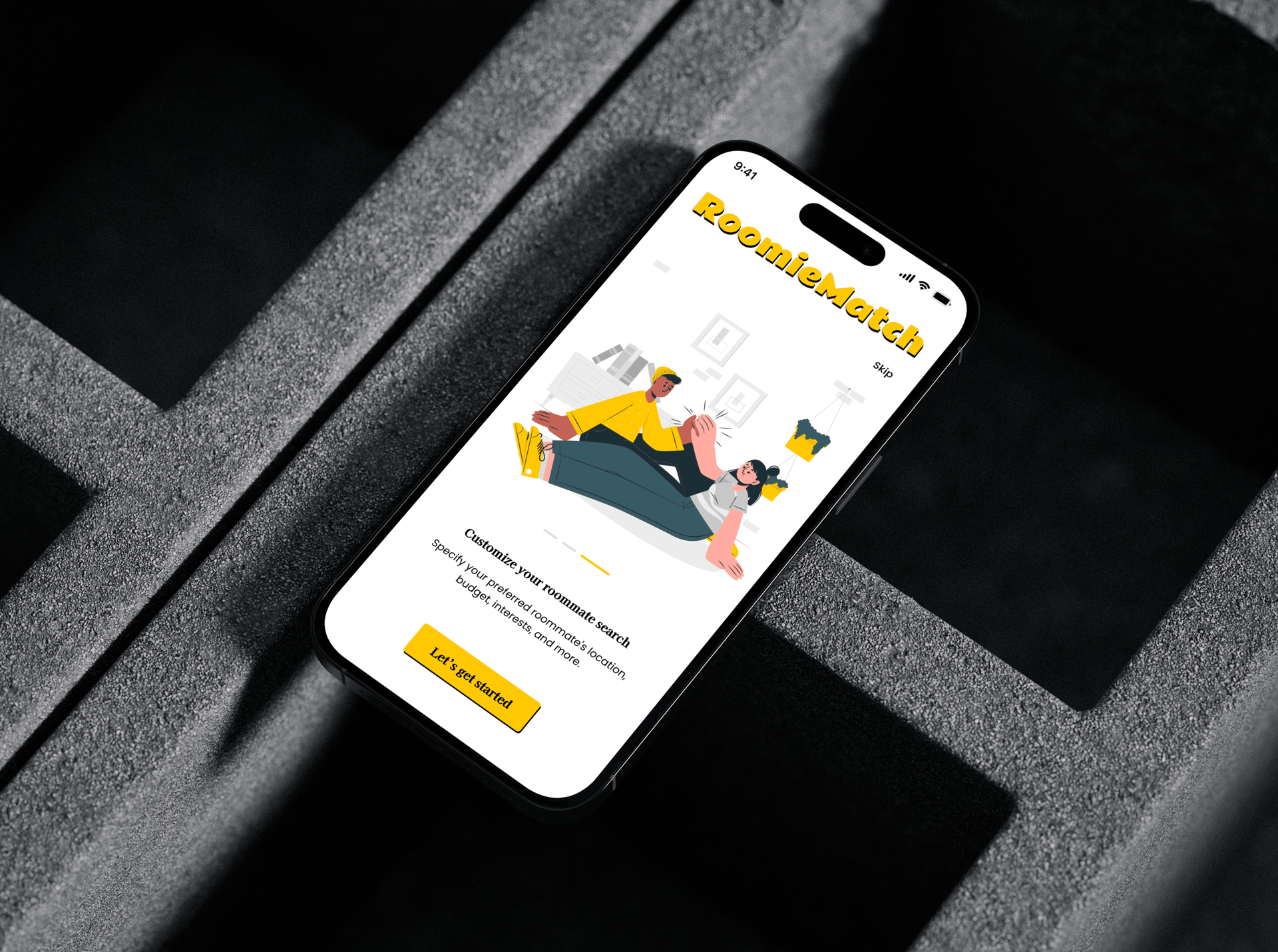
roomie match
An inviting onboarding flow for RoommieMatch, a roommate-finding app. Each screen introduces a key feature like profile setup, browsing matches, and secure chatting. The design uses clean layouts, playful icons, and a progress indicator to create a warm, simple, and user-friendly first impression.
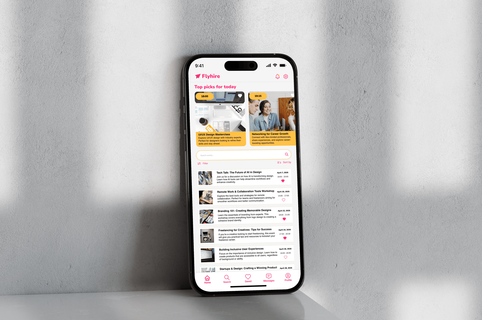
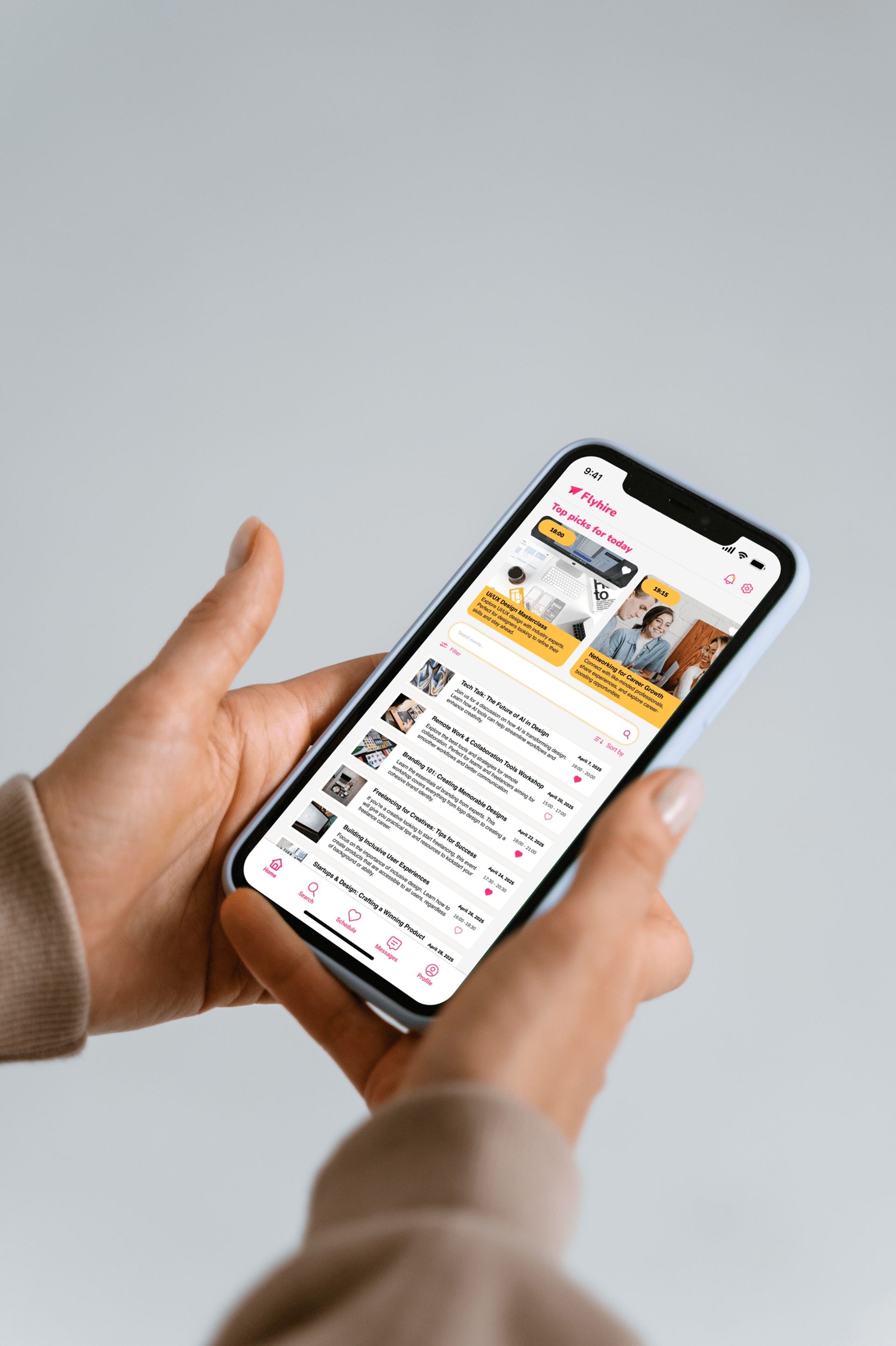
flyhire
An event listing screen for Flyhire, a career-focused app designed to help users discover and save professional growth opportunities. The layout features top event picks, search and filter tools, and a clean list view with clear titles, descriptions, and save icons for easy browsing.
Website Design
Creative and functional website designs crafted to deliver strong visuals, intuitive layouts, and smooth user experiences.
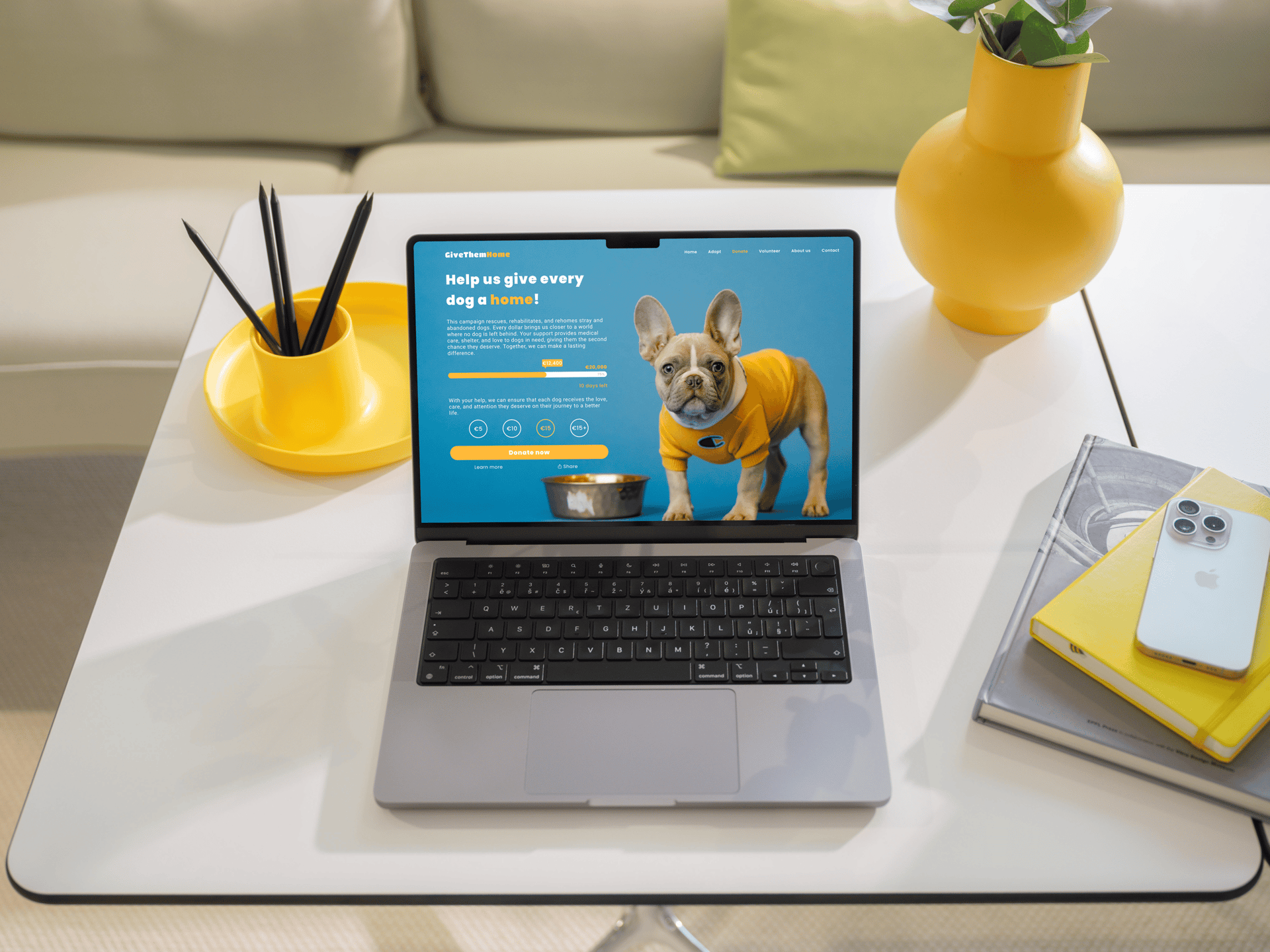
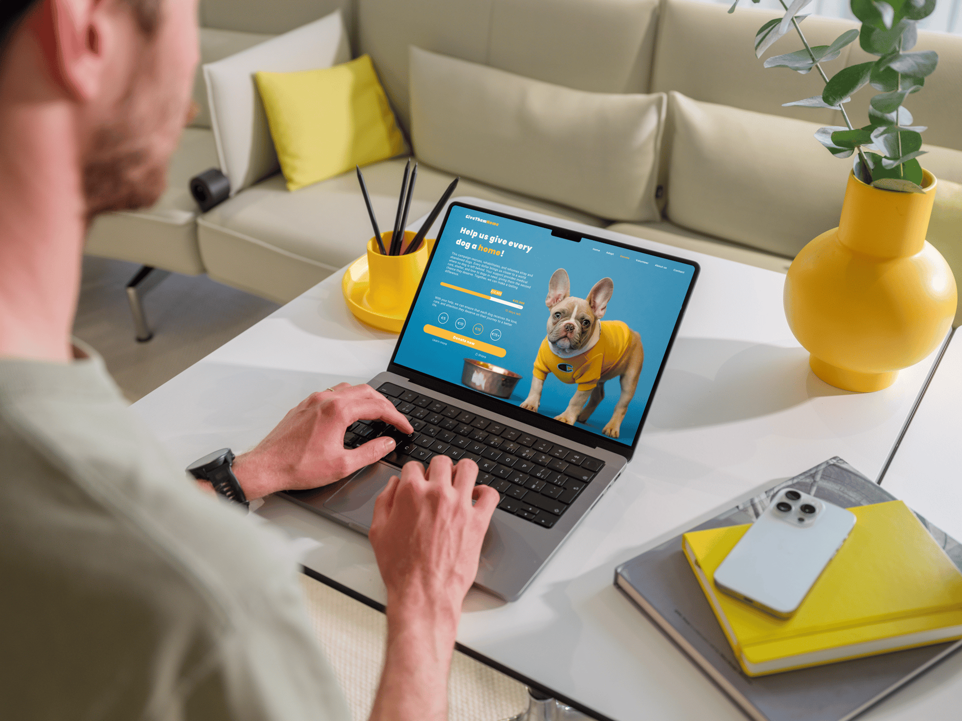
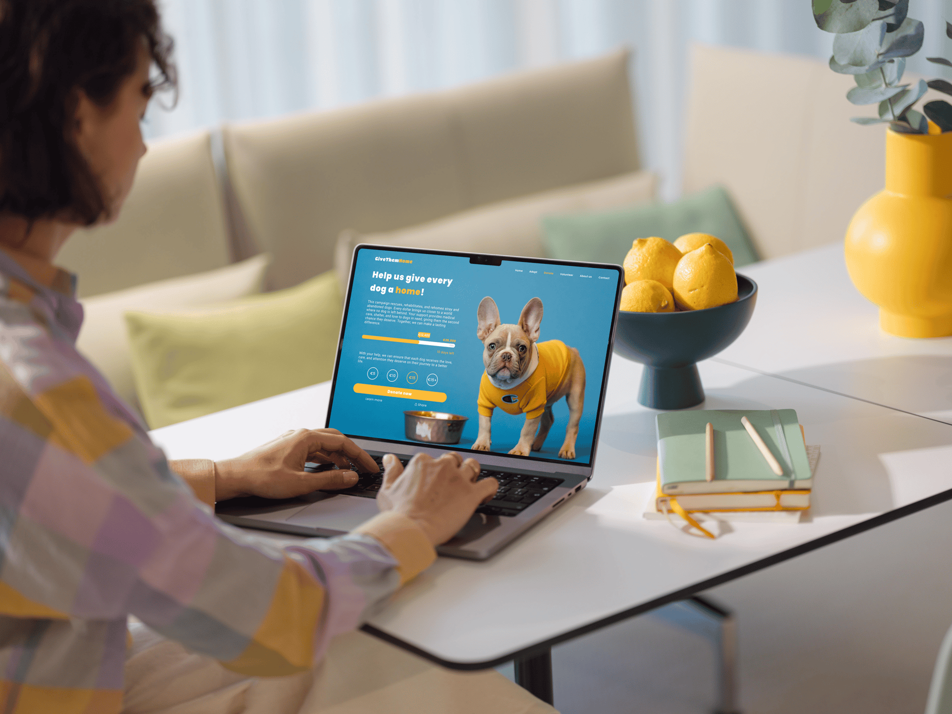
crowdfunting
A warm and inviting crowdfunding page created for an animal shelter. The design features a clear goal, progress bar, countdown timer, and suggested donation buttons to encourage support. A bright yellow call-to-action and an emotional dog photo help connect with users and drive donations, while the clean layout ensures an easy, focused experience.
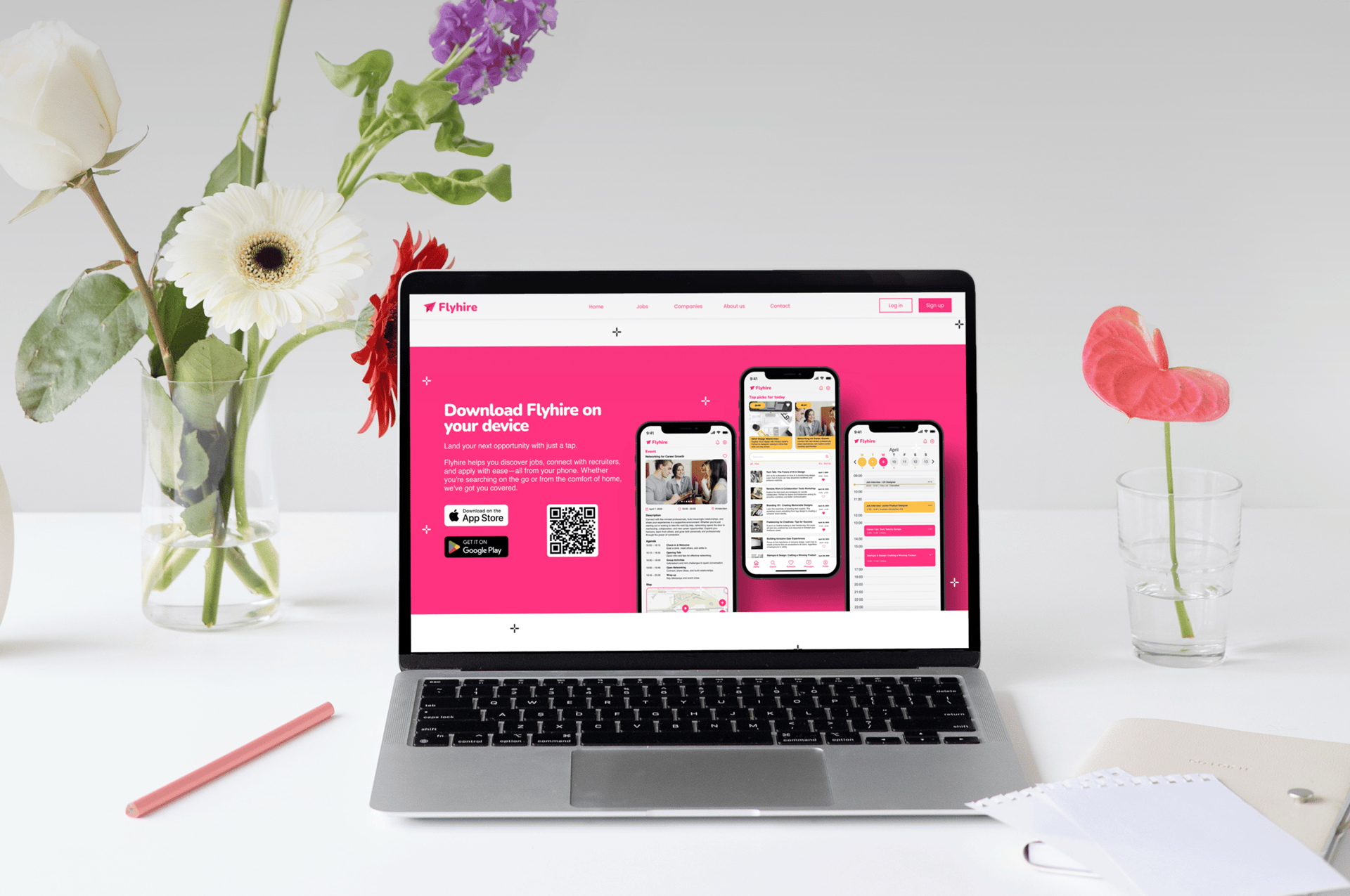
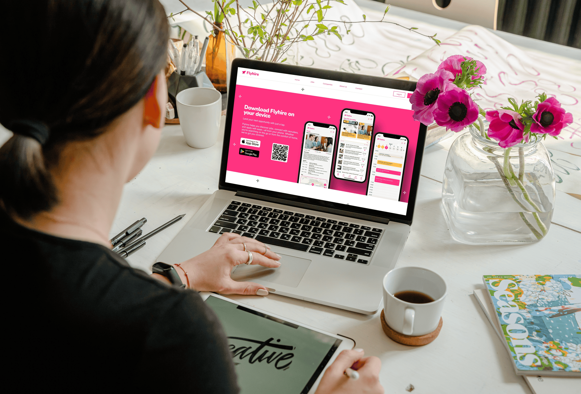
flyhire
A clean, branded download screen for the Flyhire job app, designed to guide users clearly toward the App Store or Google Play. It includes an app summary, download buttons, a QR code, and preview screenshots, all styled in Flyhire’s signature pink for consistency and clarity.
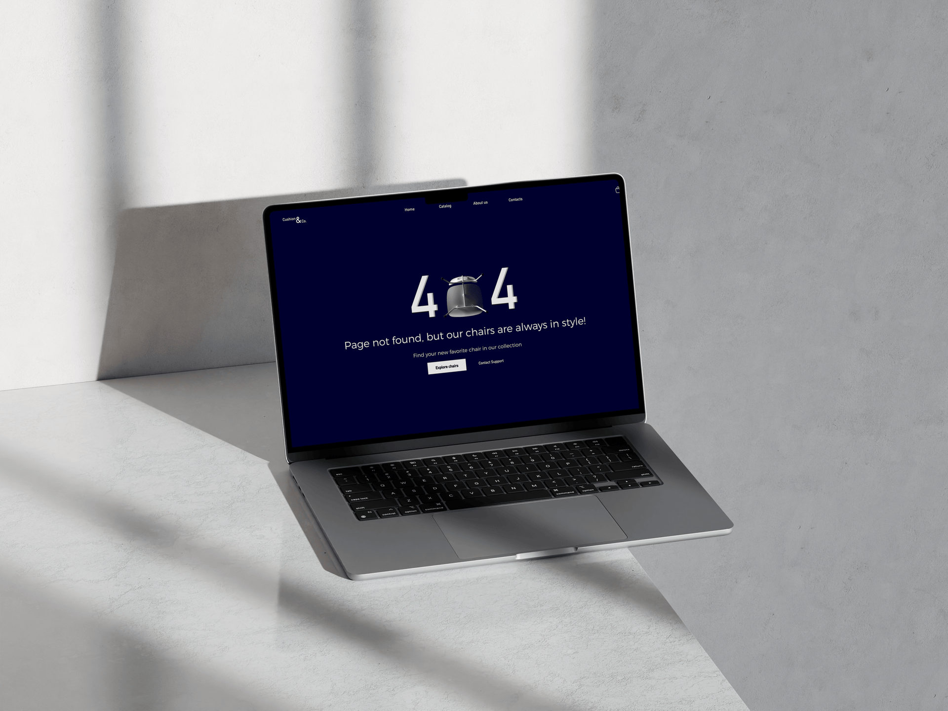
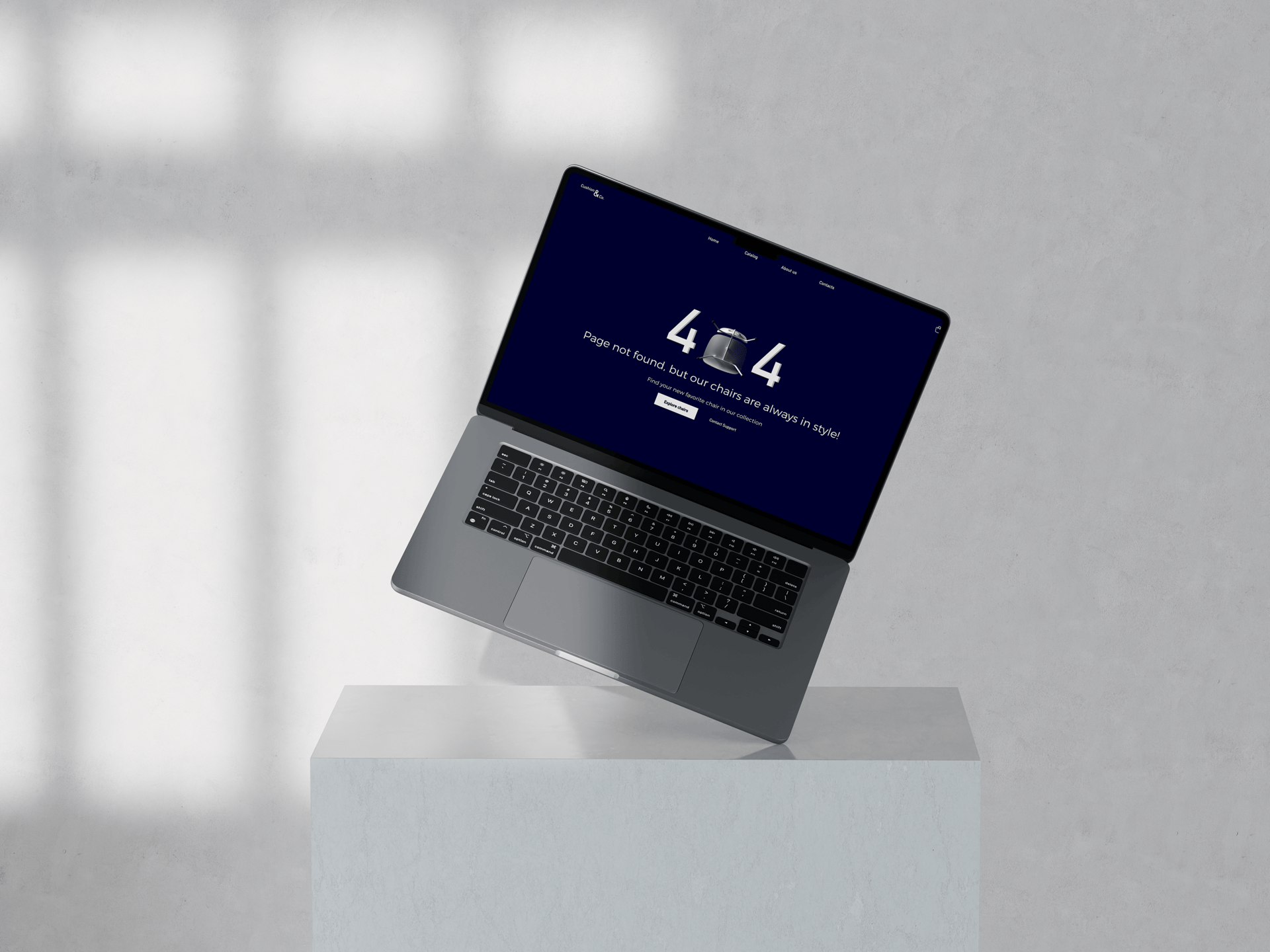
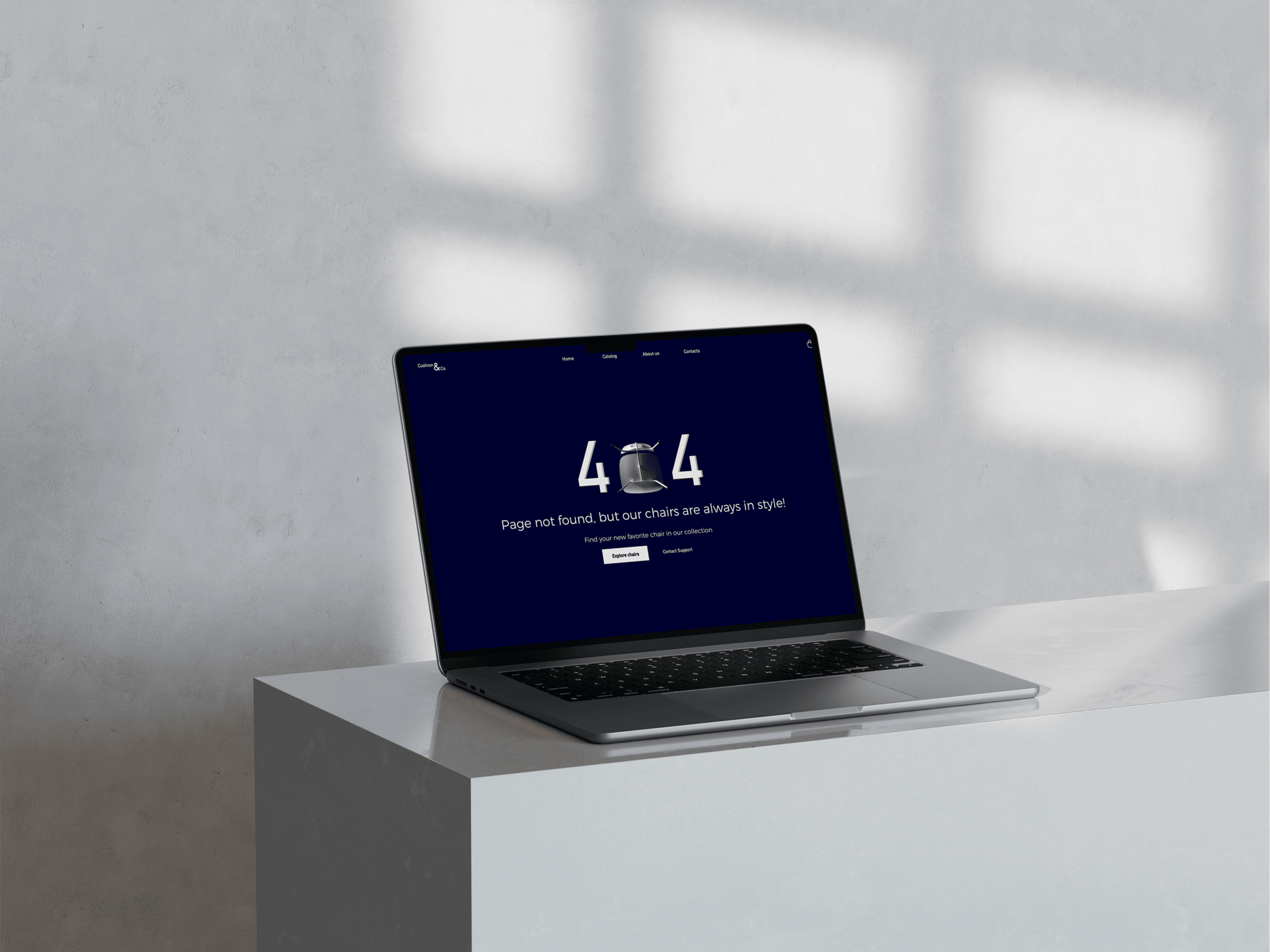
cusion&co.
A clean and modern 404 page designed for a furniture website. I used a chair as the “0” in “404” to tie the design to the brand’s identity. The layout includes a top navigation bar, a sleek hero image, and clear call-to-action buttons like “Explore Chairs” and “Contact Support” to help users quickly find their way.
Get in Touch
I’d love to hear from you! Whether you have a question or want to discuss a project, feel free to reach out.
Let’s create something amazing together!
