Flyhire

Flyhire is a career-focused platform designed to make job searching feel more approachable, engaging, and user-friendly. This concept was developed as part of the DailyUI Challenge, where I created over a dozen unique screens including job listings, event pages, social feeds, scheduling tools, and onboarding flows.
The goal was to reimagine the job hunt as something people can enjoy, not just endure. I combined a vibrant color palette with clean, modern layouts to create a warm and welcoming user experience. Each screen was carefully designed to balance usability with personality, using intuitive navigation, clear typography, and friendly illustrations to guide users through their journey.
Throughout the project, I focused on designing with empathy by building interfaces that support users emotionally and functionally as they take big steps in their careers. From the smallest button to the full user flow, Flyhire reflects my approach to thoughtful, human-centered design.
This project highlights my skills in interface design, visual storytelling, and brand consistency across mobile and web platforms.
Design Process
Defining the Vision
1
2
Sketching and Wireframing
3
Visual Design and Branding
I began by outlining the concept of Flyhire, a job search platform that feels approachable, modern, and user-first. I focused on solving real problems like overwhelming job listings and stiff, corporate interfaces.
Using Figma, I mapped out key user flows such as signing up, browsing jobs, and attending events. I created wireframes to explore layout options and test how users might move through the app with ease.
I developed a bold, playful visual style using bright pinks and yellows to break away from traditional job platforms. Each screen was designed with consistent UI patterns, clear hierarchy, and friendly illustrations that reflect Flyhire’s positive tone.

4
Prototyping and Interaction
I turned the final designs into clickable prototypes, adding smooth transitions and interactive elements that guide users without getting in their way. Each screen was refined to support both usability and delight.
5
Reflection and Iteration
Since this was part of the DailyUI challenge, I built and improved Flyhire screen by screen. With each new design, I reflected on user needs, design consistency, and the overall product feel, making sure everything aligned with the original vision.
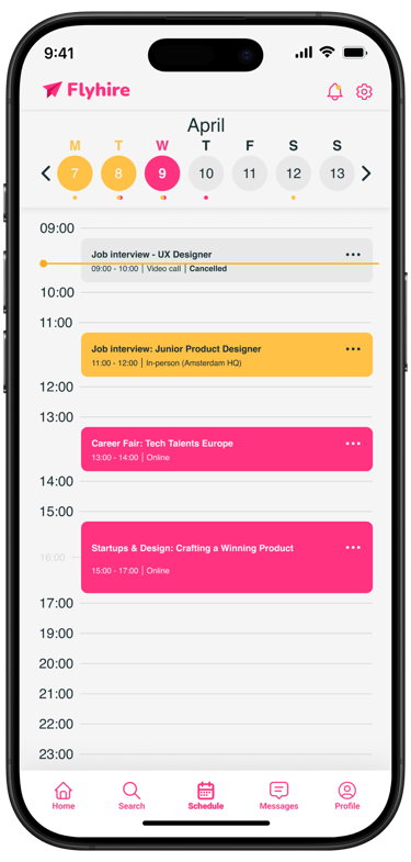
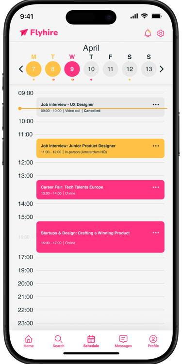
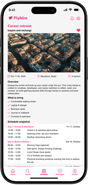
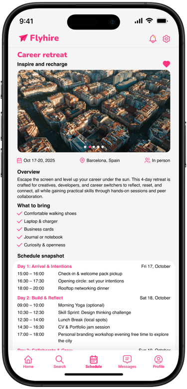
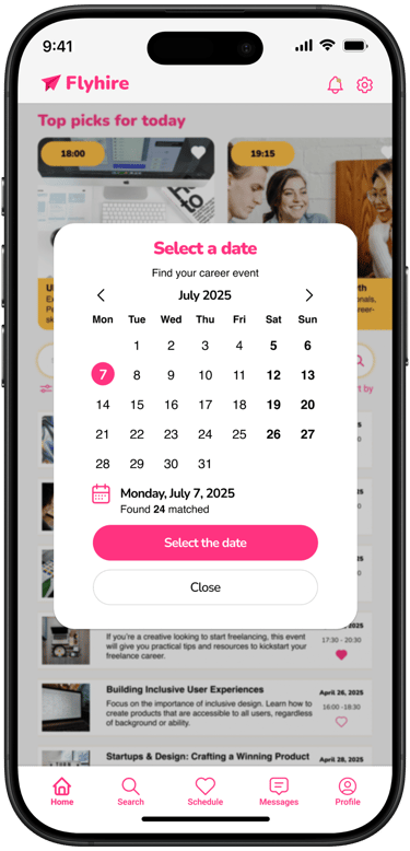
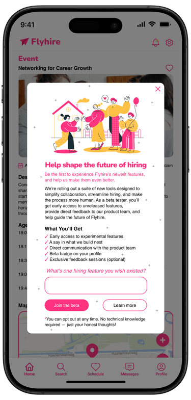
Mobile Design
Above are screens designed for the Flyhire project. Click any image to explore each screen in more detail.
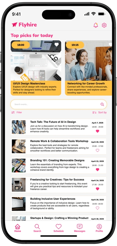
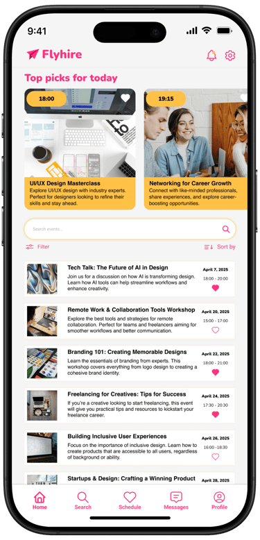
Event Listing
Scheduling
Date Picker
Status Update
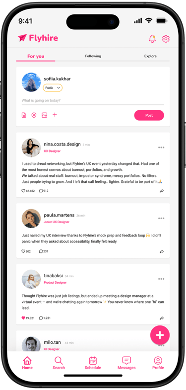
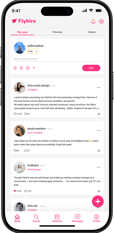
Status update
Invitation


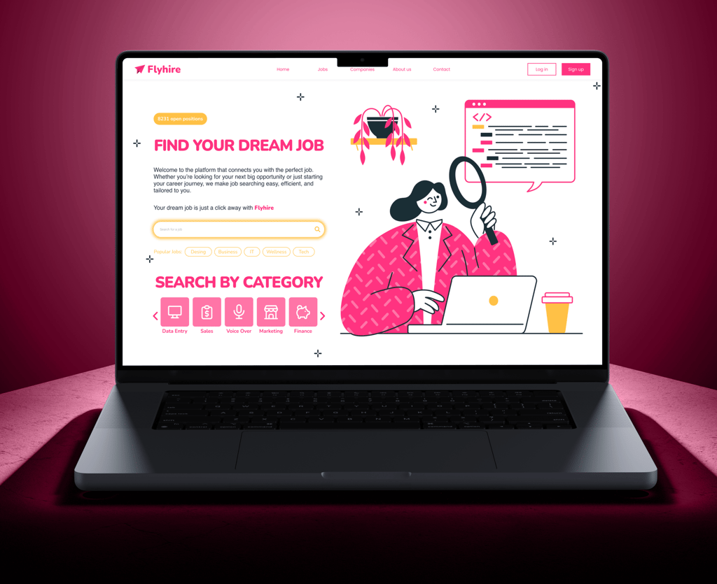
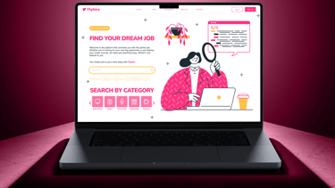
website Design
Above are screens designed for the Flyhire project. Click any image to explore each screen in more detail.
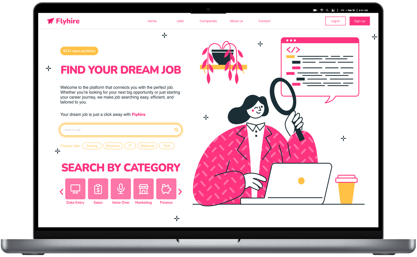
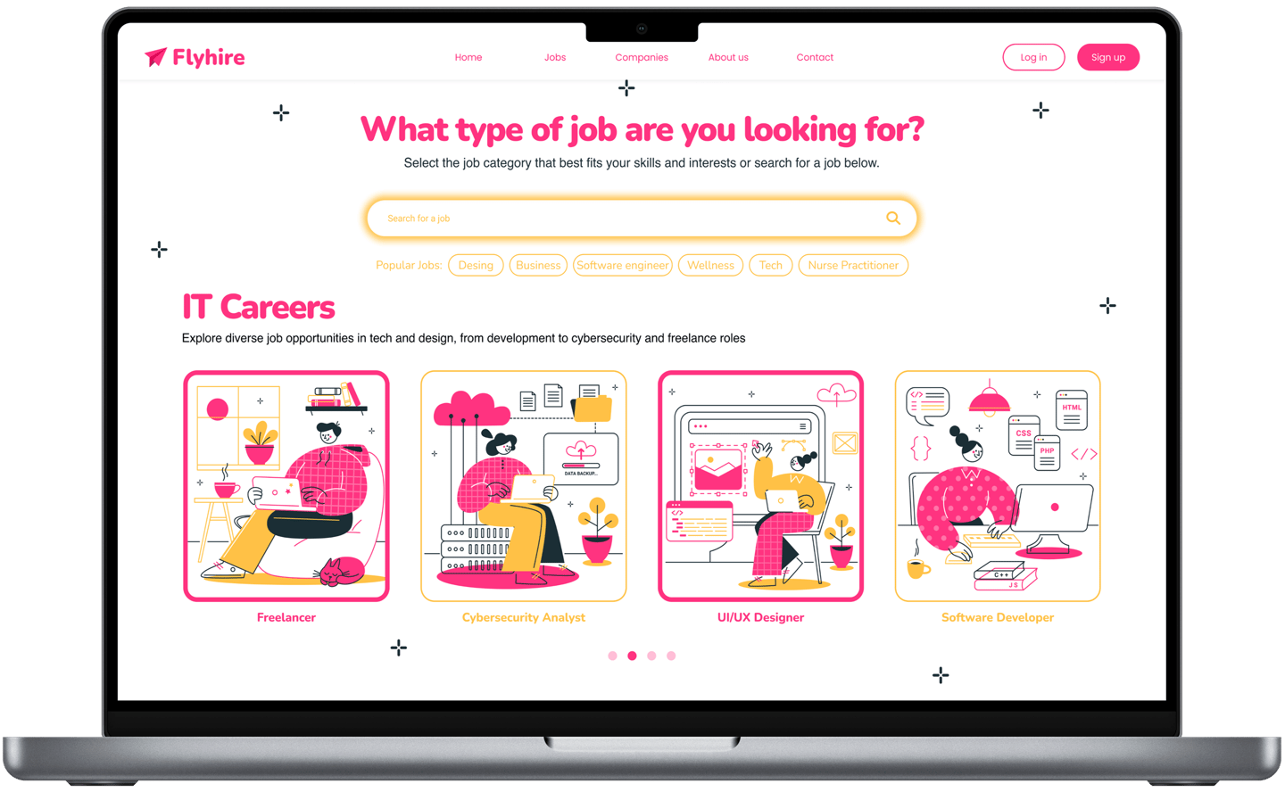
job listing
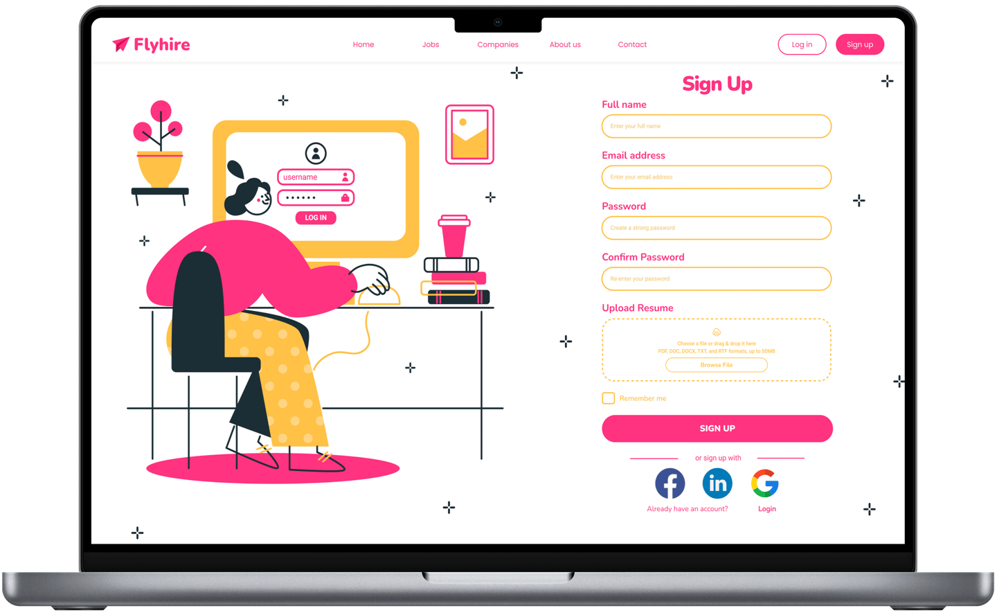
sign up form
user selection
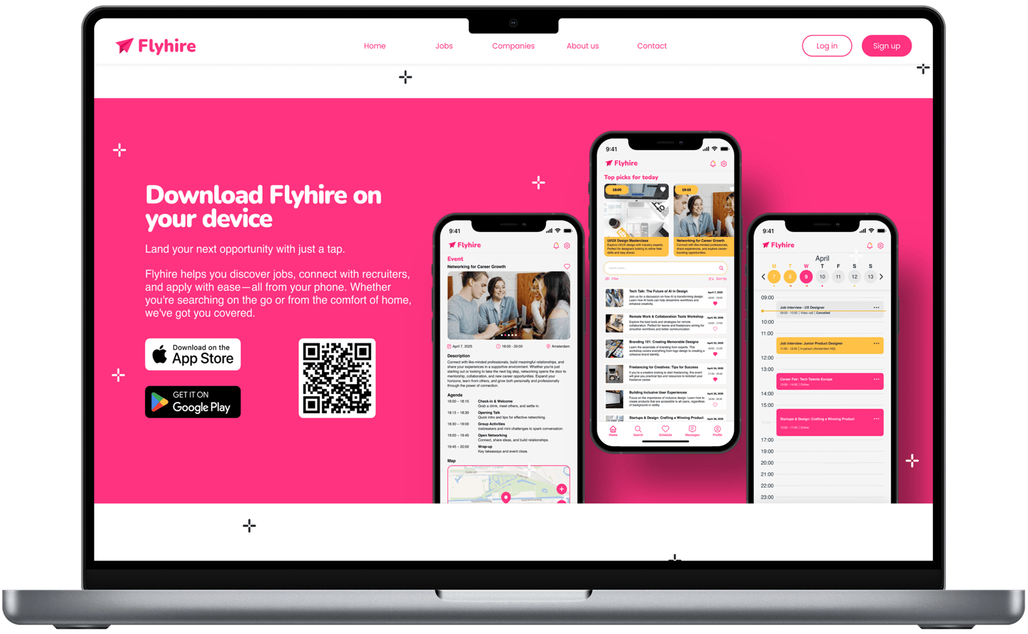
app download
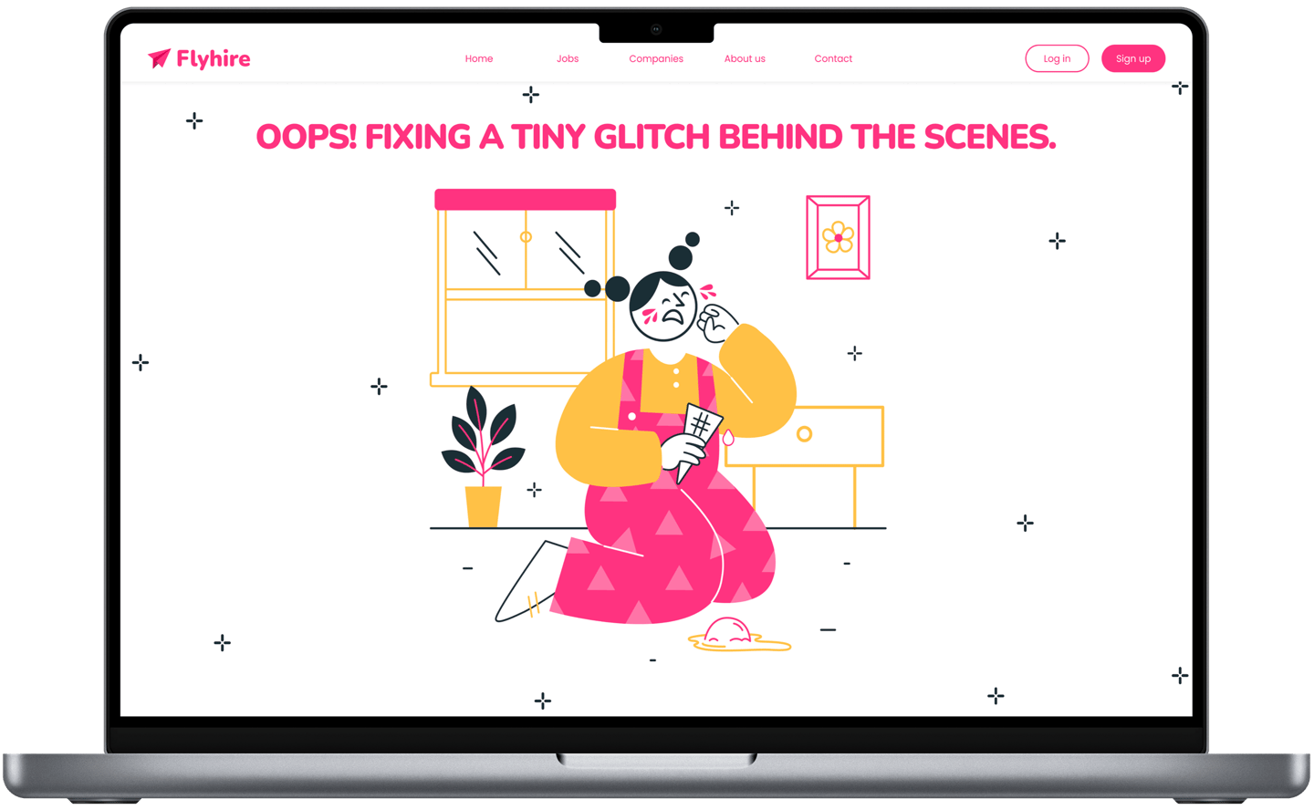
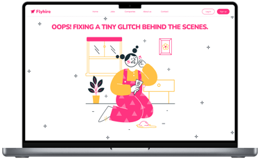
loading design
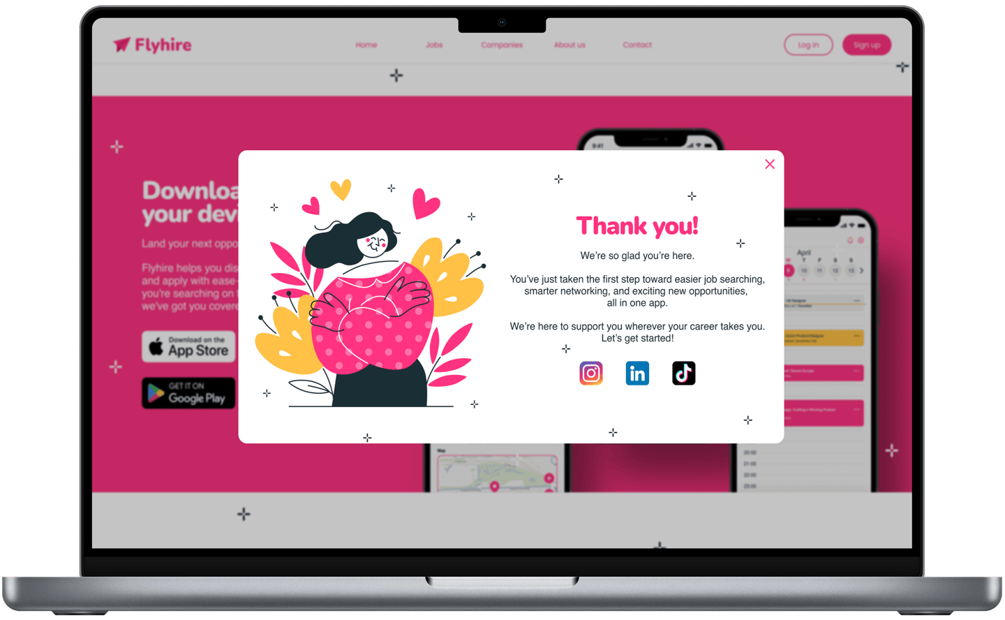
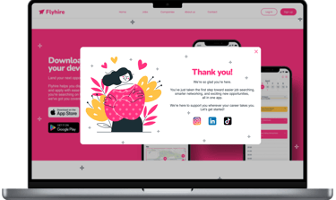
thank you message
Get in Touch
I’d love to hear from you! Whether you have a question or want to discuss a project, feel free to reach out.
Let’s create something amazing together!
