Workspace Booking

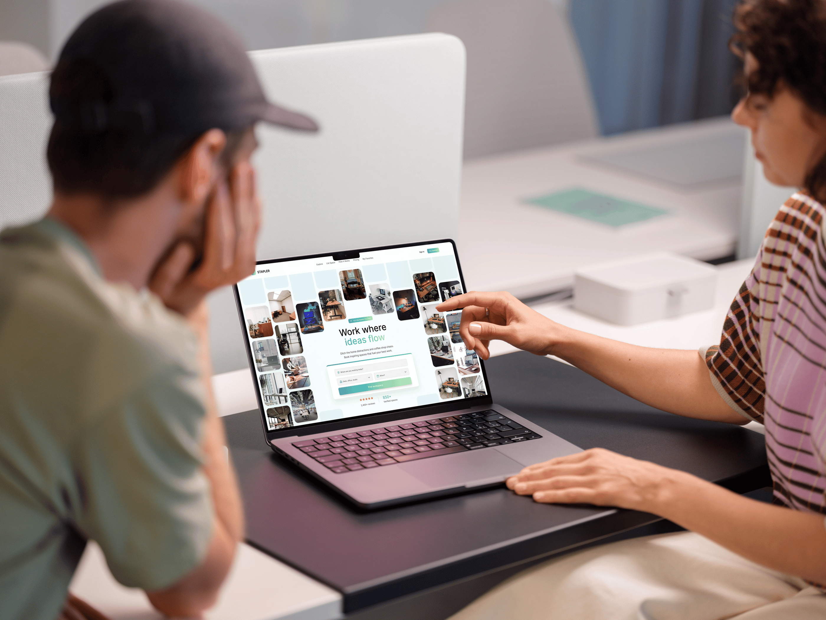
This project was designed during my graduation internship at Wunderbar, a full-service digital agency in Enschede. I took on the full design of a workspace booking platform — from first concept to final high-fidelity prototype — across both desktop and mobile.
The challenge was to build something that the existing market completely lacked: a clear, trustworthy, and frictionless booking flow that lets users find, compare, and book a workspace in just a few steps — without hidden fees, manual confirmations, or confusing layouts.
Throughout the project I ran six rounds of A/B testing, developed two competing concepts, and iterated every page based on real user feedback. The result is a complete design system and high-fidelity prototype, ready for developer handover.
A/B Testing Rounds
6
30+
Screens Designed
Platforms
2
5
Competitors Analysed
The challenge
Workspace platforms are confusing, opaque, and slow
Most competitors — from WeWork to Regus — force users through multi-step contact forms, hidden pricing, and manual confirmations. Four out of five platforms analysed didn't even allow direct booking. Freelancers and office managers needed something fundamentally different.
Lack of transparent pricing and hidden fees
Complicated booking flows without direct confirmation
Poor mobile experience and limited search filtering
No trust elements — missing reviews or host information
Inconsistent visual hierarchy across pages

Pain points found
Enable full booking in 3 clear, guided steps
Surface pricing, reviews and location upfront
Build trust through calm glassmorphism visual style
Responsive design for both desktop and mobile
Deliver a scalable design system for developer handover
Design goals
Research
1
2
Concept & Prototype
Test & Refine
3
Build. Test. Learn. Repeat.
Design process
Competitor analysis of five major platforms, user persona development, and a visual style board comparing five design directions — from neobrutalism to glassmorphism.
Two complete high-fidelity concepts were developed in Figma and presented to stakeholders. The chosen direction was refined across two-week sprint cycles, page by page.
Six structured A/B testing rounds were conducted with freelancers and office workers. Every layout decision — grid, hierarchy, buttons, forms — was validated before finalising.
Get in Touch
I’d love to hear from you! Whether you have a question or want to discuss a project, feel free to reach out.
Let’s create something amazing together!